Sting & Trudie Styler

On Saturday night, I had the pleasure of sitting in row 10 for the last night of  the North American leg of Sting's Back to Bass Tour.  The music was great, and antidotes entertaining, the lighting really well done and Sting looked amazing. 

Darko Sikman Photography

One of the things I love about being a designer is the relationships I build with my clients.  I get to know their lifestyle and their families while designing their homes.  No question when you see Sting you know he is leading a clean and healthy life which made me wonder what his home(s) would look like...

These pictures are from Architectural Digest's article on the London Home he shares with his wife Trudie and their children.  I was very excited to learn it was designed by one of my favourite architectural firms Shelton, Mindel & Associates.


I love the way they brought light through the house including the lowest level.  They were able to raise the ceiling from 7' to 9' and add the sky light over the over the table this room to make it bright and welcoming.


These next three are from their Lake House in the English Countryside.  Sting spoke about how the rolling hills of barley inspired him to write Fields of Gold.

Lake House

Lake House
Lake House

These are from Jan 2011 Architectural Digest and focus mainly on the landscaping surrounding their Tuscan home. 

Tuscan Home

I love this shaded garden for dining.
`

This reminds me of the house my friends and I stayed at in Tuscany last year.

Tuscan Home


White On White (and a touch of Grey)

Inspired by the Yabu Pushelberg interiors of the newly opened "The Room" of  The Bay, I started to think about some of my favourite white paint colours.  Anyone who has ever picked up a paint fan deck knows that not all whites are created equal.  There is a full spectrum of whites - some are warm, some cool, others tint beige, pink, yellow or blue.  The Benjamin Moore OC palette has more than 140 colours all considered "off-white".

The one thing that all whites have in common is a need for natural light.  If you paint a darker room all white, it will tend to look a bit grey in the shadows.  This isn't a bad thing, if you like grey like I do, and you might even consider pairing white with grey in the same room - such as white cabinets and grey walls or carrera marble.

My favourite Benjamin Moore whites are Cloud White - great overall warm easy to live with white.  Simply White - a bright clean white without too much grey.  Decorator White - classic and popular white with designers, looks great with greys and blacks.  Super White - revered by many American designers as the perfect white.  Although it is not part of the Canadian Benjamin Moore colour line up, the formula is available and can be mixed at any Ben Moore dealer.

My favourite Benjamin Moore greys are Kendall Charcoal & Overcoat - both great for mill work and walls, Days End - one of my favourites for interior doors, Revere Pewter - beautiful for kitchen cabinetry and Chelsea Grey - great mid tone colour. 

Regardless of your personal design aesthetic, the perfect white will work in any environment - modern, traditional or anything in between.


Metropolitan Home


Elle Decor

Unknown

Apartment Therapy

Kirste Michelini

unknown

Met Home

unknown


QB 3 loft

Joseph Dirand


Melinda Ritz Interiors

The November Architectural Digest features the eclectic Beverly Hills home of Ellen DeGeneres & Portia de Rossi.  Designed by architects Buff & Hensman and further expanded on by decorator Melinda Ritz.  I love the personality that comes out in these photos, and the lived in, collected look of this home.


Melinda Ritz design philosphy is to create homes that truly express the lives of the people who inhabit them.  The fact that her background is in set design makes perfect sense.  She won 3 Emmy awards and 7 nominations for Will &Grace - one of my all time favourite shows!

Here are some pictures from her website of her beautiful work!


All photos Melinda Ritz


The Room

My most fashionable friend Lisa called me yesterday with an invitation to attend the grand opening party for The Room at The Bay.  With a full work schedule and not a lot of time or energy I re-accessorized the black dress I wore to work with some fabulous jewelry and headed out completely unprepared for what I was about to experience.


The 23,000 sq ft Yabu Pushelberg designed space is a new shopping experience for The Bay.  It is much more like a Parisian department store than one I expected to find in my own backyard.  This really should come as no surprise since Yabu Pushelberg is also responsible for the beautiful interiors at Printemps.

The party was very well attended, complete with fashion designers, models and the beautiful people of Vancouver.  As much as I appreciate fashion, while Lisa was checking out the clothing, I was absorbing the decor.  White walls, white floor, crisp clear lighting perfect for highlighting colour and small accents of black throughout.  On the back wall, thick white shelves decorated in beautiful shoes with a flutter of white sculptural flowers seemingly floating above.


I love these renderings of The Room.


Now all we need is a breath taking roof top patio with a 360 degree view, and maybe an Eiffel Tower...


Printemp, Paris

Le Deli-Cieux, Printemps

Ombre - Shaded or graduated in tone

Summer has arrived in Vancouver, just in time for fall!  But who can really complain...hot sunny days and evenings cooling off just enough to sleep.  I have been inspired by my good friend Michelle's very stylish hair to take a closer look at the Ombre trend.  I like how these images segue nicely from summer to fall as well...


Anthropologie


Shabby goes Modern


Chanel

Cheeky Chic Vintage

J. Robert Scott


Fixtures Living

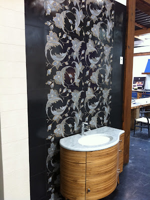
Friday, I had THE BEST experience shopping for plumbing fixtures and appliances with my San Diego client.  Fixtures Living is like no other shopping experience.  Upon arrival, we were offered cappuccinos, lattes or an Arnold Palmer (lemonade ice tea blend).  As we walked around the showroom assisted by Raychel we were amazed at the vignettes and the product lines available.  Fixtures Living quite smartly had local designers and builders create each of the individual bathroom and kitchens - showcasing not only their personal style, but beautiful tile and lighting available through San Diego suppliers, as well as the plumbing fixtures and appliances available at the showroom.

After narrowing down the style for the faucet and sinks and discussing appliance needs Raychel led us over to the restaurant where lunch was being served for everyone shopping at Living Fixtures on Friday!  Over the course of our lunch two of the owners came over to introduce themselves and refill our Arnold Palmers. 

Fixtures Living has really gone back to basics with their attitude towards customer services and how they treat their employees.  I wouldn't hesitate to refer them more business in the future.

In September they are opening their third store in Costa Mesa.  I can't wait to see it - apparently it is even better (if that is possible).

Exterior of San Diego Store

Love the wood sink

This rock wall is back lit.


These walls are steel with jade(?) carved medallions lit from behind.

Custom stainless steel sink and work area
Restaurant in Fixtures Living
Related Posts Plugin for WordPress, Blogger...